
Made for women who belong to themselves
YEAR
2026
INDUSTRY
Artisanal handmade jewelry
SERVICE
Brand Strategy & Design
DELIVERABLES
Identity, Design System, Packaging, Website
✦ THE BRAND
Wild Alchemy is a boutique jewelry house founded by a spiritual coach who makes each piece by hand. Bold yet weightless, the collections are designed for the woman who wears her jewelry like intention — a moon at the collarbone, a sun at the ear.
Our task was to give that feeling a form: an identity as vivid and feminine as the maker, and as considered as the ritual of putting a piece on.
✦ THE BRIEF
Bold and barely-there, at once.
Wild Alchemy came to us as a name, a feeling, and a maker’s hands — but no way to look as considered as the work already was. It needed to feel expensive and spiritual without tipping into cliché, and personal enough that one woman could apply it herself, by hand, on every order.
✦
A mark that could carry both weightlessness and presence
✦
A system simple enough to hand-apply on every piece and parcel
✦
Packaging that feels like a gift before it is opened
✦
A website that sells a feeling, not a spec sheet
✦ THE SOLUTION
One celestial system — a single mark, a night-and-gold palette, endlessly composable.
We distilled the brand to four feelings and built everything from them. Deep indigo for the night sky, hand-drawn gold for the light, and a four-point star that becomes signature, seal, and spark across every touchpoint.
Bold
Confident scale, high-contrast type, and a mark that holds its own on the smallest tag.
Light
Air around everything — hand-drawn lines, weightless spacing, gold that floats rather than shouts.
Sacred
Celestial symbolism and ritual pacing, so each piece feels like a talisman, not a product.
Feminine
Soft curves, blush-warm golds, and the maker’s own hand — made by a woman, for the women who wear her.
✦ HOW WE WORKED
A ritual, not a rollout.
01
Attune
Long conversations with the maker — her practice, her women, the words she repeats.
02
Explore
Logo routes, motif studies, and palettes — wide first, then narrowing to the one that felt inevitable.
03
Refine
Drawing the bird and star by hand until the curve, weight, and spacing sang together.
04
Apply
Rolling the system across packaging, print, photography, and a Framer site — every touchpoint on-brand.
✦ THE SYSTEM, BRIEFLY
Four parts,
one language.
A symbol, a logotype, a palette, and a motif set — small enough to hold in the hand, flexible enough to run from a hang tag to a homepage without ever losing the line.

01 — SYMBOL

02 — LOGOTYPE
Midnight Indigo
#0F1730
Twilight
#26315A
Antique Gold
#C8A35A
Moonstone
#F4F0E9
03 — PALETTE

✦
04 — MOTIF
✦ THE MARK
The whole identity began with a bird — an ancient emblem of transformation and lightness, and the truest picture of what these pieces are meant to do: lift you. We drew it again and again until it became a single continuous gold stroke, weightless as ink still wet.

REFERENCE

SKETCH

REFINE

FINAL MARK
✦ THE ROUTES
We presented three complete directions — each true to the celestial brief, each a different balance of bold and light. Wild Alchemy chose the first.

✦ SELECTED
01 · The Flight
Flowing script with the bird cresting the words — movement, softness, signature.

02 · The Seal
A W·A monogram inside a radiant star — compact, emblematic, made for wax and metal.

03 · The Halo
Stacked capitals held in a fine sun-ring — architectural, grounded, quietly grand.
✦ THE IDENTITY
One mark, every register.
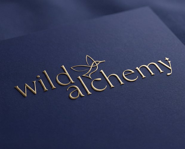
Primary, stacked, and symbol-only lockups — with generous clear space and a reversed cut for light grounds. Enough range to breathe, tight enough to always read as Wild Alchemy.
or browse files


✦ PACKAGING
A gift, before it is opened.
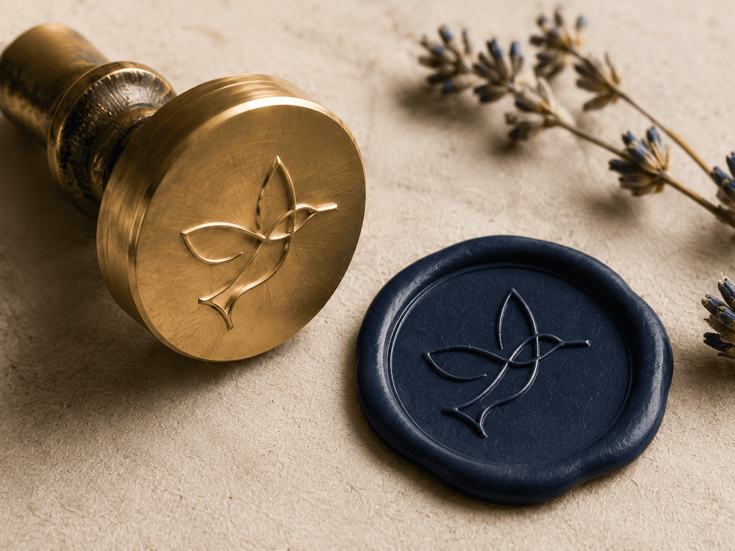
Indigo envelopes, velvet pouches and hand-tied parcels, each sealed with the gold star. The reveal is part of the ritual — slow, tactile, and unmistakably hers.

or browse files

Velvet drawstring pouch — ‘wild alchemy’
or browse files

✦ HANG TAGS
Small cards, big work.
The earring hanger is the first thing she holds. We treated it as a miniature poster — the mark, the star, a whisper of copy — so even the tag feels collectible.

✦ STATIONERY
The details that outlast the sale.
Business cards, thank-you notes and care cards in navy and gold, letterpressed where it counts. The system that greets her also stays with her.

✦ PHOTOGRAPHY
Shot like ritual, not retail.
We art-directed on indigo linen under low gold light — pieces first, then worn. Macro details sit beside quiet portraits, so the range reads as sacred objects rather than product shots.


or browse files


✦ THE WEBSITE — BUILT IN FRAMER
An editorial homepage that leads with feeling, a celestial product story, and a shop that still feels handmade — deep indigo, gold detailing, the same unhurried voice, carried pixel to pixel.
VIEW THE LIVE SITE ↗
wildalchemy.co
CUE STUDIO
Have a maker’s brand that should feel like magic?
We turn a name and a feeling into a visual world people want to enter, remember, and hold onto.
✦


