
A logo does not explain a business. It hides one idea in a simple shape. How the parts carry meaning, from the FedEx arrow to the Apple bite.
What does a logo actually communicate?
A logo communicates an idea about a company in the shortest possible form. Its job is not to describe what a business does, but to hold a single feeling or thought that people recognize instantly and remember later.
The best logos are containers. They start almost empty, then fill with meaning over time as people experience the company behind them. This is why a mark that looks simple can carry so much, and why chasing complexity usually backfires.
Every part of a logo is doing a job
In a good logo, nothing is there by accident. Every line, shape, color, and even the empty space is chosen to carry meaning. The cleverest marks hide a second idea inside a simple shape, so you feel it before you notice it.
FedEx is the classic example. Look at the gap between the E and the x and you will find an arrow. Lindon Leader designed it into that empty space in 1994, and it quietly signals speed and forward motion, exactly what a delivery company wants you to feel. Most people never consciously spot the arrow. It works anyway. The space between the letters is not empty. It is carrying the message.
Amazon does something similar with one small curve. The arrow runs from the a to the z, a simple way to say the shop sells everything from A to Z, and it doubles as a smile. Turner Duckworth built two meanings into a single line, with no words at all.
Sometimes color carries the idea instead of shape. The NBC peacock fans out in bright feathers because the network wanted to show that its programmers were broadcast in color.
The form is a bird. The message is the color. Sometimes a deliberate flaw does the work. Rob Janoff put the bite in the Apple logo in 1977 so the apple could not be mistaken for a cherry at small sizes. It also happened to pun on the word byte. One small detail solves a real problem and adds a touch of wit.
Even plainness can be the message. Sir Peter Scott drew the WWF panda in 1961 in simple black and white so it could be printed cheaply anywhere, and he used soft, rounded shapes so it would feel gentle and universal. The restraint is the meaning.
These are the examples design books return to again and again, and they all teach one thing. A logo is not a picture placed on a company. It is a small machine where every part, including the empty space, is built to carry a feeling or an idea.
The Paul Rand principle: simplicity that holds meaning
Paul Rand shaped how modern companies think about identity, and his marks still teach the core lesson. He designed the logos for IBM, UPS, ABC, and Westinghouse, and each one proves that reduction is a form of strength.
The IBM mark uses stripes to make three heavy letters feel light and precise, a quiet signal of order and engineering. The ABC logo reduces three letters to their simplest circular form, so it reads in an instant on any screen. The UPS mark, in its original form, held a sense of reliability and care that matched the promise of the company.
Rand argued that a logo does not need to explain the business. It needs to be distinctive, memorable, and simple enough to work everywhere, from a letterhead to a truck. A logo derives meaning from the quality of the thing it stands for, not the other way around. This is the most important idea in the discipline. The mark does not create the reputation. It stores it.
Rand set this thinking down early. In “Thoughts on Design,” published in 1947 when he was in his early thirties, he argued that design is functional before it is decorative, and that a strong mark should survive reduction and distortion, even being blurred or partly obscured, and still be recognized. A logo that fails that test is carrying too much.
His method stayed consistent for four decades. Understand the problem, find the visual metaphor, then reduce until nothing unnecessary remains. IBM first hired him in 1956 and kept him for close to forty years, a rare continuity that let one idea mature rather than restart with each campaign. Late in his career he designed the NeXT identity for Steve Jobs, presenting a single concept in a bound booklet for a fee of one hundred thousand dollars. Jobs accepted it without alternatives and called Rand the greatest living graphic designer. The story is usually told for the fee, but the real lesson is the conviction. Rand sold judgement, not options. As he put it, design is the silent ambassador of a brand. The mark does not argue the case. It carries the reputation quietly into every room the company cannot reach in person.
The lineage after Rand: modern voices agree
Rand did not work alone, and the designers who followed built on his principles rather than replaced them. The same lesson runs through seventy years of design. Keep the mark simple, so people remember it.
Massimo Vignelli, the Italian modernist behind the 1972 New York City subway signage and the long-lived American Airlines mark, held that a small, disciplined set of choices outlasts fashion. His book “The Vignelli Canon” argues for timelessness over novelty, the same instinct that keeps Rand’s marks in service today.
Chermayeff and Geismar built much of the American corporate landscape, from the 1960 Chase Manhattan symbol, one of the first purely abstract marks adopted by a major company, to Mobil, PBS, and National Geographic. Their partner Sagi Haviv, who has designed identities for the US Open and Harvard University Press, offers the clearest modern test of a trademark. A good logo, Haviv argues, must be appropriate to its subject, distinctive enough to hold meaning, and simple enough to be drawn from memory. It is Rand’s principle restated as a checklist.
The tradition is alive in contemporary practice. At Pentagram, Paula Scher’s identities for Citibank and the Public Theater, and Michael Bierut’s work for Saks Fifth Avenue and Mastercard, apply the same discipline to a faster, more digital world. A mark now has to work as a favicon, an app icon, and an animation, which makes simplicity more demanding, not less.
The brand strategist Marty Neumeier connects the whole lineage back to feeling. A brand, he writes, is a person’s gut feeling about a product or company. The logo is not that feeling, but it is the trigger for it, which is why the mark has to be simple and consistent enough to become familiar. Familiarity is how a symbol turns into a feeling.
What a logo can and cannot do
A logo cannot tell people everything about a company, and trying to make it do so is the most common mistake. When a mark tries to describe every service, it communicates nothing clearly.
A logo can do four things well. It can be recognized at a glance. It can hold a feeling. It can flex across every size and surface. It can last long enough to become familiar. Familiarity is where a logo gains its real power, and familiarity requires simplicity and consistency over years.
Judge a logo by whether it is distinctive, whether it works at every scale, and whether it will still feel right in ten years. Do not judge it by whether it explains the business on first sight.
Lessons from our own work
The same principles that guide Rand’s marks guide the identity work at Cue Studio. A logo earns its keep through clarity, distinctiveness, and the ability to carry meaning as the brand grows.
Take VZBL. The V letterform doubles as an upward arrow, built from modular blocks, so the mark reads as growth and momentum before a word is understood. The meaning is in the shape, the same way FedEx hides an arrow in its empty space.

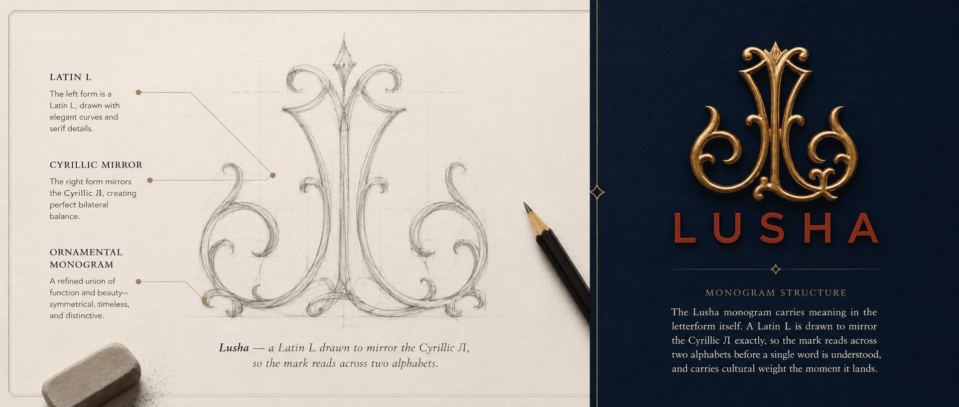
The Lusha monogram carries meaning in the letterform itself. A Latin L is drawn to mirror the Cyrillic exactly, so the mark reads across two alphabets before a single word is Л understood, and carries cultural weight the moment it lands.
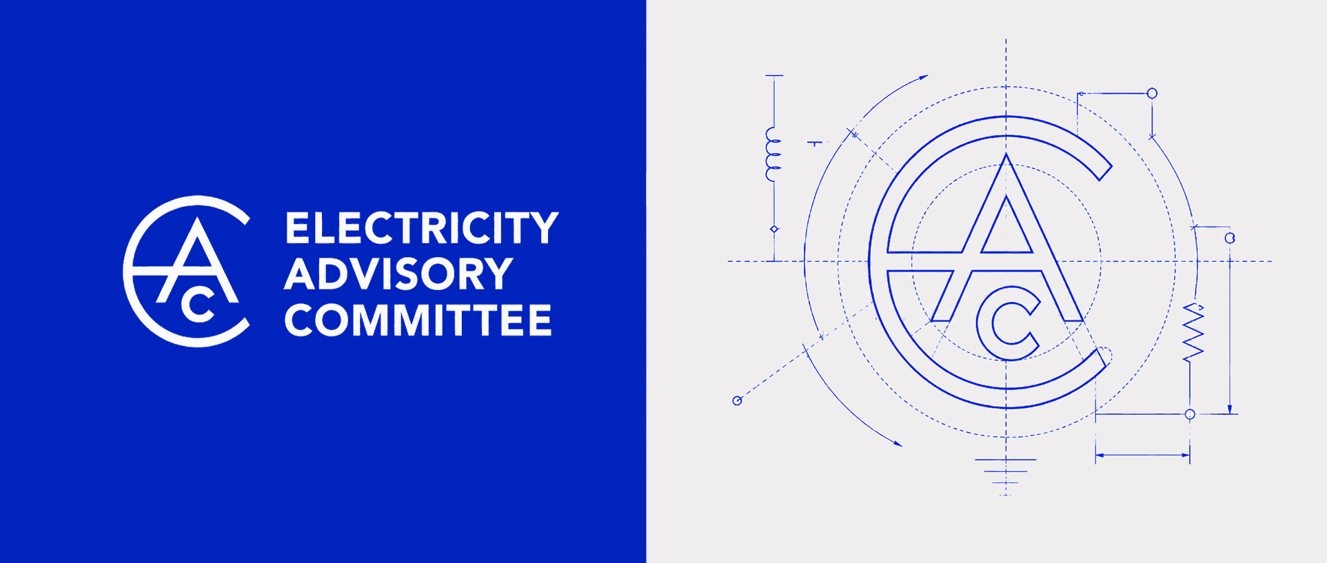
The mark for the Electricity Advisory Committee folds its initials into one circular C. The form echoes vintage electrical shapes and balances every letter inside a single symbol, so the mark signals unity and reads cleanly at any size.
For each mark, the goal was the same one Rand described. Find the simplest form that holds the right idea. Remove anything that does not serve it. Build a shape distinctive enough to own and clean enough to survive every place it will appear.
How to know if your logo is communicating
Ask three questions. Would someone recognize this mark after seeing it twice? Does it hold up when it is very small and very large? Does it feel like your company, or like a trend that will date? If the answers are yes, the logo is doing its job. If the mark is trying to explain the business rather than represent it, it is carrying the wrong load. A logo is a signature, not a sentence.
References
Rand, Paul. “Thoughts on Design.” 1947.
Rand, Paul. “Design, Form, and Chaos.” 1993.
Vignelli, Massimo. “The Vignelli Canon.” 2010.
Haviv, Sagi (Chermayeff & Geismar & Haviv). On the criteria for an effective trademark: appropriate, distinctive, simple.
Neumeier, Marty. “The Brand Gap.” 2003.
You might also like


Have a question?
From pricing to process, here are a few common questions.
If you don’t see yours here, get in touch.