
A brand's look is not taste. It is strategy made visible. How a creative director proves a visual direction, read through Apple and Lego.
What is visual positioning?
Visual positioning is the translation of a brand’s strategy into a visual language, so that people see the brand and feel the intended position without being told. It is the look working as an argument, not as decoration.
Every brand wants to be read a certain way. Premium. Positive. Trustworthy. Built for a boardroom. Visual positioning is the craft of making the design carry that meaning, so the impression a viewer forms in a second matches the strategy on paper.
The creative director’s real job
A creative director does not decide what looks nice. The real job is to decide what the brand should mean, then choose and defend the visual direction that communicates it.
That means turning a few strategic words into hundreds of visual decisions, and being able to explain every one. If the positioning is premium and C-suite-oriented, the type, the space, the color, and the imagery all have to earn that reading. Taste is not the point. Proof is. A creative director should be able to point at any element and say which part of the positioning it delivers.
From positioning words to visual decisions
A positioning is usually just a few words. The work is translating each one into something you can see.
If the brand should feel premium, the direction leans on restraint, generous space, quality materials, and a narrow palette. If it should feel positive, it uses warmth, light, open shapes, upward movement, and real human faces. If it should feel built for the C-suite, it trades noise for calm authority, serious typography, understatement, and room to breathe. The same word can be shown in many ways, but each choice has to be deliberate and consistent, because inconsistency reads as uncertainty.
How to prove a visual direction
You prove a visual direction by showing the link between every choice and the position it delivers, then checking that real people read the intended meaning.
The method has three moves. Define the position in plain words first, before any design. Encode each attribute into a visual decision you can justify out loud. Then test whether the audience describes the brand the way you intended, without being prompted. A direction is proven when nothing is arbitrary and the meaning lands as designed. If a choice cannot be defended, it is decoration, and decoration is where positioning leaks away.
Apple: a visual direction that proves its positioning
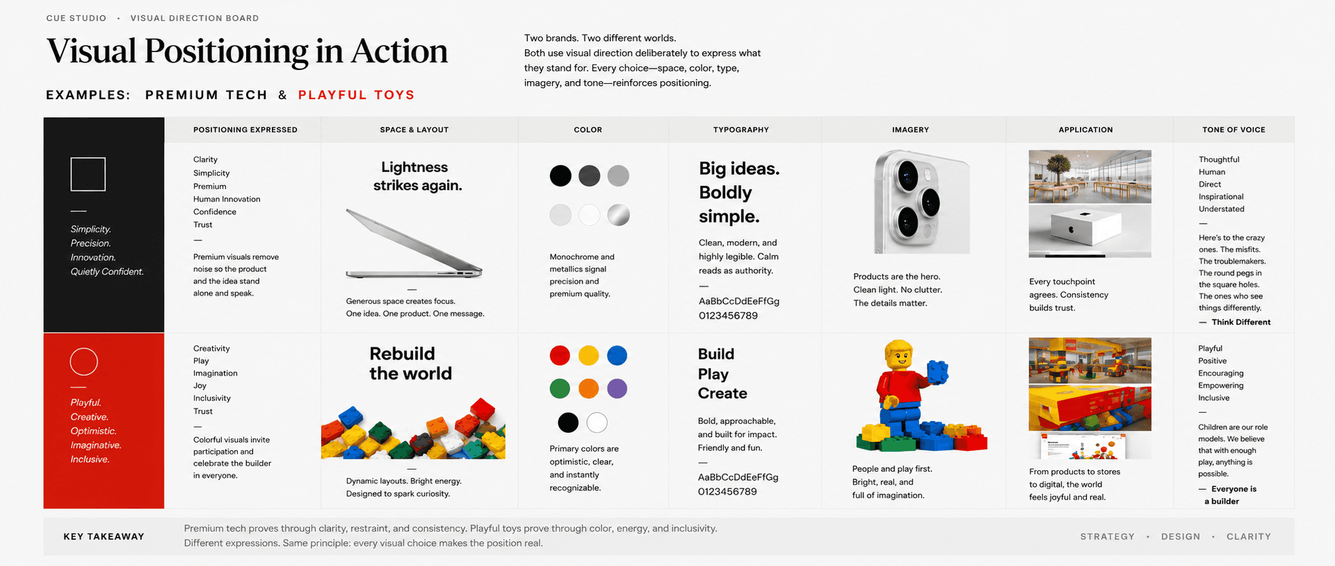
Apple is the clearest example of visual positioning done deliberately. The brand positions itself as simple, premium, human, and quietly confident, and almost every visual choice proves one of those words.
Start with the space. Apple leaves more emptiness around its products and words than nearly any competitor. Space is expensive, so using it generously signals confidence and premium value. Only a brand sure of itself leaves that much room, and the space forces attention onto one thing at a time.
Then the restraint. Apple’s design descends directly from Dieter Rams and his principle of less but better. Jony Ive drew openly on Rams, to the point that the early iPod echoed Braun’s T3 radio. Removing clutter is not emptiness. It reads as clarity and control, which is exactly the position Apple wants.
Look at the photography. Products sit alone, lit cleanly, often on white. The message is that the product is the point and the brand does not need to shout. The typography is calm and unfussy, which reads as authority rather than excitement. And every touchpoint agrees, from the store to the website to the box, so the consistency itself reads as trust.
Even the messaging followed the visuals. The Think Different campaign positioned Apple around creativity and human ambition, not specifications. None of this is accident. Apple’s visual direction is its positioning made visible, and you can point at any element and name the position it proves.
Positioning can be measured, not only felt
A visual direction is not purely a matter of judgment. Brand perception can be measured. Researchers and rating firms score brands on named qualities, from authority and trust to warmth, friendliness, and playfulness, so a vague feeling becomes a comparable picture.
The contrast between Lego and Apple makes this clear. Both are loved, and both sit in completely different places. Lego owns playful and friendly. Apple owns premium and sophisticated. Neither profile is better than the other. Each one fits its strategy. The lesson for any brand is to know which qualities it needs to own, then check whether its visuals actually deliver them.
This is why strong visual direction starts from evidence rather than taste. Measure what the brand communicates today, compare it to the perception it needs, and let the gap set the direction. When a choice can be tied to a quality the business needs to project, the work stops being decoration and becomes a decision you can defend.
How Cue Studio proves visual direction
Cue Studio treats visual direction as an argument to be defended, not a matter of taste. The process starts by naming the position in plain words, translates each attribute into deliberate visual decisions, and pressure-tests whether people read the intended meaning before anything is committed.
The result is a direction the studio can stand behind choice by choice. When a client asks why the brand looks the way it does, there is an answer for every element, tied back to the position it was built to prove.
How to know your visual direction is working
Ask three questions. Can you name your position in a few plain words? Can you point at any visual choice and say which part of that position it delivers? Do people describe the brand the way you intended, without being told? If the answers are yes, the direction is proven. If the brand only looks nice, it is not yet doing its job. A visual direction is not there to be admired. It is there to make a position unmistakable.
References
Rams, Dieter. “Ten Principles for Good Design.” Braun.
Apple and Jony Ive, on minimalism and the influence of Dieter Rams.
“Think Different.” Apple with TBWA, 1997.
You might also like


Have a question?
From pricing to process, here are a few common questions.
If you don’t see yours here, get in touch.