The poetry of Slavic living

YEAR

2025

INDUSTRY

Artisan Lifestyle

SERVICE

Brand Strategy & Design

DELIVERABLES

Identity, Design System, Uniforms, Store Front, Packaging, Social, Editorial, Website

THE STORY

We didn't decorate
a brand. We built one
— from the name out.

Lusha came to us as a feeling and a name — nothing more. No mark, no palette, no rules. We gave the feeling a system: one monogram, one restrained palette, one voice, applied across more than a dozen touchpoints until a brand-new label looked like an old, expensive secret.

Lusha came to us as a feeling and a name — nothing more. No mark, no palette, no rules. We gave the feeling a system: one monogram, one restrained palette, one voice, applied across more than a dozen touchpoints until a brand-new label looked like an old, expensive secret.

01

01

THE CLIENT

An artisan heritage house

An artisan heritage house

Lusha makes everyday Slavic ritual beautiful — small-batch confiture, hand-finished linen, tea and table goods. Made slowly, in limited runs, for people who notice the details.

Lusha makes everyday Slavic ritual beautiful — small-batch confiture, hand-finished linen, tea and table goods. Made slowly, in limited runs, for people who notice the details.

02

02

THE BRIEF

The Solution

The Solution

Exquisite products, impeccable taste, and nothing to hold them together. The ask was total: create the brand from scratch — every mark, surface and word — and make it look expensive without ever saying the word.

Exquisite products, impeccable taste, and nothing to hold them together. The ask was total: create the brand from scratch — every mark, surface and word — and make it look expensive without ever saying the word.

03

03

THE PROBLEM

Premium is easy to claim

Premium is easy to claim

The category is crowded with gold foil and floral cliché. Anyone can look nice; few look considered. Lusha needed an identity disciplined enough to carry a jar, a magazine and a shop door alike — and elastic enough to grow into products that don't exist yet.

The category is crowded with gold foil and floral cliché. Anyone can look nice; few look considered. Lusha needed an identity disciplined enough to carry a jar, a magazine and a shop door alike — and elastic enough to grow into products that don’t exist yet.

04

04

THE SOLUTION

One system, drawn from ritual

One system, drawn from ritual

A navy-and-gold palette borrowed from old bindings and lacquer boxes. A custom monogram cut from Slavic ornament — built to emboss as cleanly as it prints. Editorial serif, quiet sans. One calm, exact system that reads the same everywhere.

A navy-and-gold palette borrowed from old bindings and lacquer boxes. A custom monogram cut from Slavic ornament — built to emboss as cleanly as it prints. Editorial serif, quiet sans. One calm, exact system that reads the same everywhere.

SCOPE

Every element of
the brand — designed,
not borrowed.

01

Tone of voice & positioning

02

Naming lockup & monogram

03

Color system

04

Typographic system

05

Art direction & visual world

06

AI photography

07

Packaging suite

08

Print & editorial

09

Store branding

09

Uniforms & nameplates

10

Retail & environment

10

Merchandise

11

Gifting & seasonal

12

Social system

13

Motion graphics

14

Website

THE SYSTEM

A foundation built
to hold everything.

THE MARK

Drawn, not chosen.

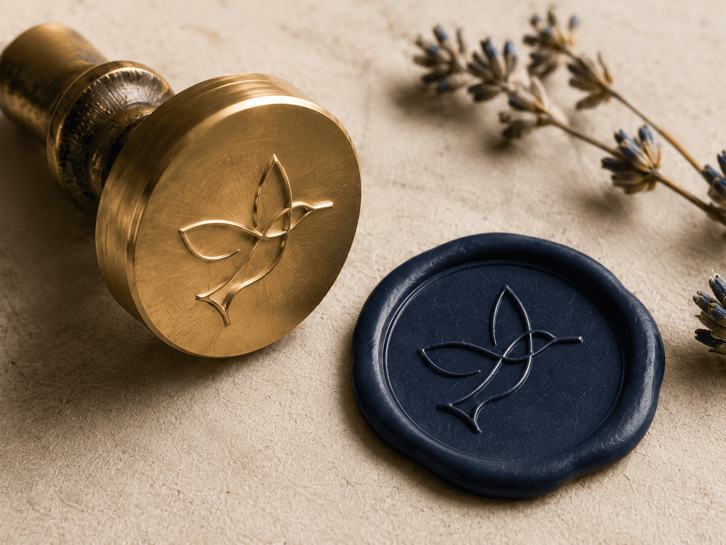
The Lusha monogram is anchored by the Latin L at its center — a letterform that mirrors the Cyrillic Л exactly, making the mark legible in both alphabets before a single word is read. "Л" is shared across Slavic languages — Russian, Ukrainian, Belarusian, Bulgarian, Serbian, Macedonian — so the mark carries cultural weight the moment it lands.

The result is symmetrical enough to emboss, fine enough to foil in gold, and confident enough to stand alone on a shop door. It anchors every touchpoint that follows.

Drawn, not chosen.

The Lusha monogram is anchored by the Latin L at its center — a letterform that mirrors the Cyrillic Л exactly, making the mark legible in both alphabets before a single word is read. "Л" is shared across Slavic languages — Russian, Ukrainian, Belarusian, Bulgarian, Serbian, Macedonian — so the mark carries cultural weight the moment it lands.

The result is symmetrical enough to emboss, fine enough to foil in gold, and confident enough to stand alone on a shop door. It anchors every touchpoint that follows.

Color · 60 / 30 / 10

THE MARK

TYPOGRAPHY

Layout Principles

Structure you can feel.

  • Editorial grid — 2 to 3 columns

  • Left-aligned composition

  • Generous negative space

  • Layered depth

  • Asymmetrical balance

Materials & Texture

Warm to the touch.

Natural fiber, wood, linen and ceramic. Handcrafted surfaces with visible imperfection — close detail, shallow depth of field, nothing too perfect to feel real.

Brand Imagery

Photographed like memory.

  • Warm natural lighting

  • Heritage objects, modern styling

  • Hands, rituals, human presence

  • Rich contrast — teal, red, gold

Materials & Texture

Warm to the touch.

Natural fiber, wood, linen and ceramic. Handcrafted surfaces with visible imperfection — close detail, shallow depth of field, nothing too perfect to feel real.

Materials & Texture

The system is built to scale. A restrained colour framework keeps contrast high and usage consistent across channels. Type defines hierarchy and pacing — when to be loud, when to hold back. Layouts rely on clean structure and generous spacing, so every element earns its place rather than fights for it.

Graphic elements and motion work as accents, not decoration. The goal is clarity first, impact second — always in that order. From a confiture jar to a billboard, the guidelines keep everything cohesive, confident, and unmistakably Lusha.

The system is built to scale. A restrained colour framework keeps contrast high and usage consistent across channels. Type defines hierarchy and pacing — when to be loud, when to hold back. Layouts rely on clean structure and generous spacing, so every element earns its place rather than fights for it.

Graphic elements and motion work as accents, not decoration. The goal is clarity first, impact second — always in that order. From a confiture jar to a billboard, the guidelines keep everything cohesive, confident, and unmistakably Lusha.

The system is built to scale. A restrained colour framework keeps contrast high and usage consistent across channels. Type defines hierarchy and pacing — when to be loud, when to hold back. Layouts rely on clean structure and generous spacing, so every element earns its place rather than fights for it.

Graphic elements and motion work as accents, not decoration. The goal is clarity first, impact second — always in that order. From a confiture jar to a billboard, the guidelines keep everything cohesive, confident, and unmistakably Lusha.

CONSISTENT · CRAFTED · MEANINGFUL · TIMELESS

  • CONSISTENT · CRAFTED · MEANINGFUL · TIMELESS

Identity

The mark, made physical.

The mark, made physical.

Lusha came to us as a feeling and a name — nothing more. No mark, no palette, no rules. We gave the feeling a system: one monogram, one restrained palette, one voice, applied across more than a dozen touchpoints until a brand-new label looked like an old, expensive secret.

Lusha came to us as a feeling and a name — nothing more. No mark, no palette, no rules. We gave the feeling a system: one monogram, one restrained palette, one voice, applied across more than a dozen touchpoints until a brand-new label looked like an old, expensive secret.

Packaging

One label system, many forms.

One label system, many forms.

One label system, many forms.

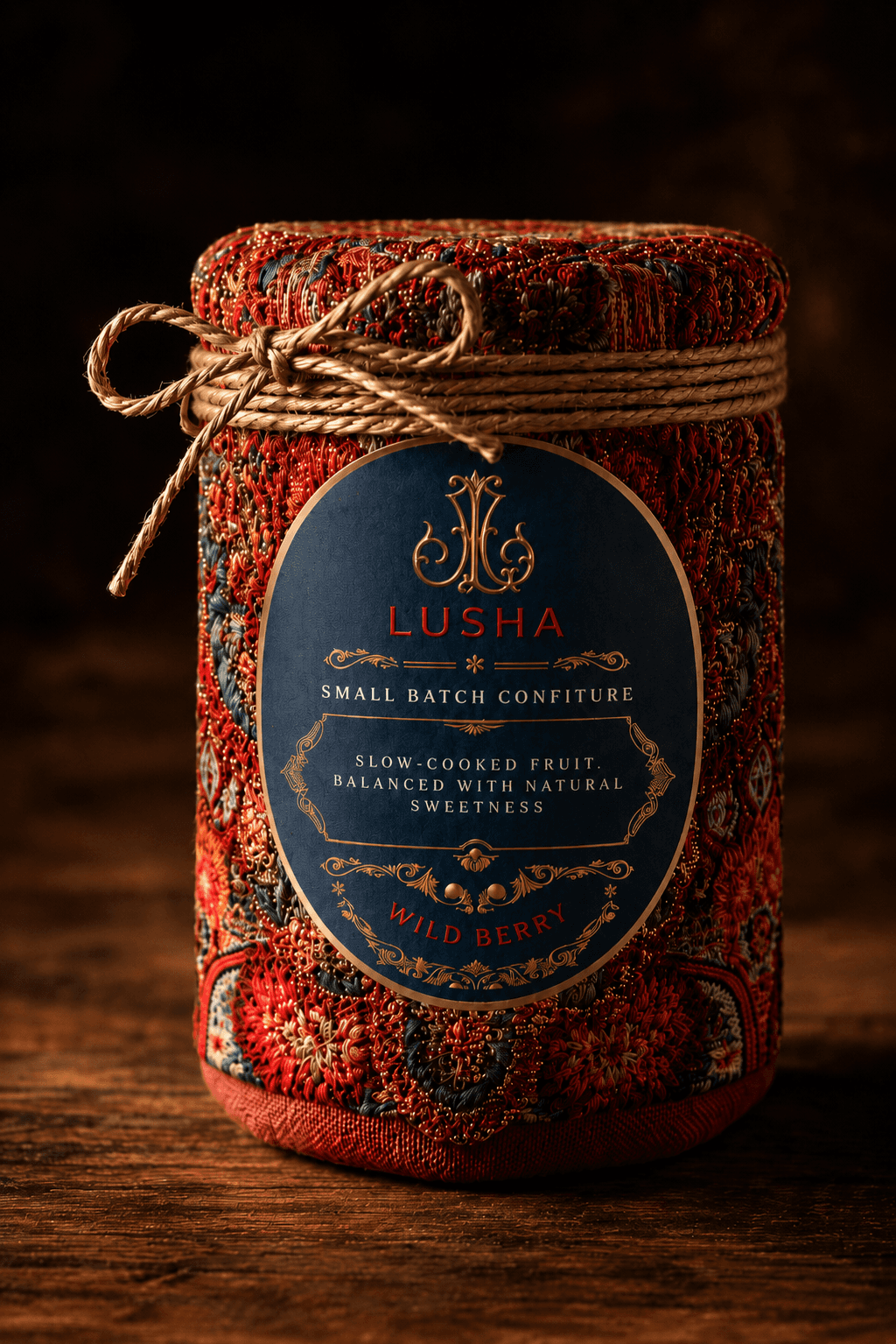
Confiture, honey, chocolate and textiles — a single label architecture that flexes across jars, boxes and wraps without losing the line. Pattern, foil and navy do the talking; the layout never changes

Confiture, honey, chocolate and textiles — a single label architecture that flexes across jars, boxes and wraps without losing the line. Pattern, foil and navy do the talking; the layout never changes

Print & Editorial

A world worth printing.

A world worth printing.

An editorial and pitch-deck system that sells the whole universe — a magazine that reads like a story, hang-tags written like little ones, business cards built to feel like objects.

An editorial and pitch-deck system that sells the whole universe — a magazine that reads like a story, hang-tags written like little ones, business cards built to feel like objects.

Retail & Environment

A space that feels owned.

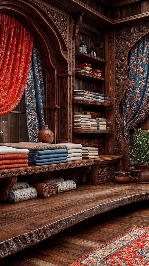
From storefront to shelf — the brand extends into interiors, signage and the small printed things that make a room unmistakably Lusha.

From storefront to shelf — the brand extends into interiors, signage and the small printed things that make a room unmistakably Lusha.

Uniforms & Nameplates

Staff as the most-seen edition.

Staff as the most-seen edition.

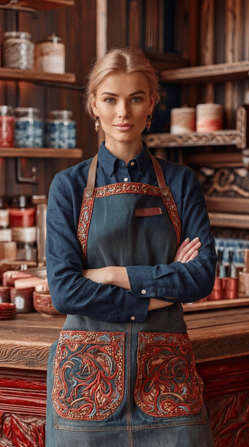
Aprons, pins and leather nameplates — the brand worn, not just printed. The people become part of the identity.

Aprons, pins and leather nameplates — the brand worn, not just printed. The people become part of the identity.

Objects & Gifting

Small batch. Hand finished.
Unmistakably Lusha.

From Ceylon cinnamon bundles tied in red twine to hand-stitched linen sachets and embroidered napkin sets — every Lusha product is designed to feel like a gift before it's unwrapped. The label, the binding, the monogram charm: nothing is accidental.

Gift cards and seasonal sets complete the physical range. Email campaigns extend it digitally — the same typographic system, the same navy and gold, the same unhurried tone. Every touchpoint, on-brand.

From Ceylon cinnamon bundles tied in red twine to hand-stitched linen sachets and embroidered napkin sets — every Lusha product is designed to feel like a gift before it’s unwrapped. The label, the binding, the monogram charm: nothing is accidental.

Gift cards and seasonal sets complete the physical range. Email campaigns extend it digitally — the same typographic system, the same navy and gold, the same unhurried tone. Every touchpoint, on-brand.

Website

The site opens like a cover.

The site opens like a cover.

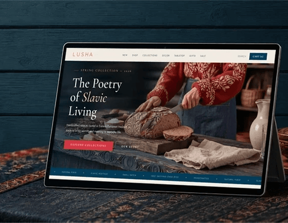
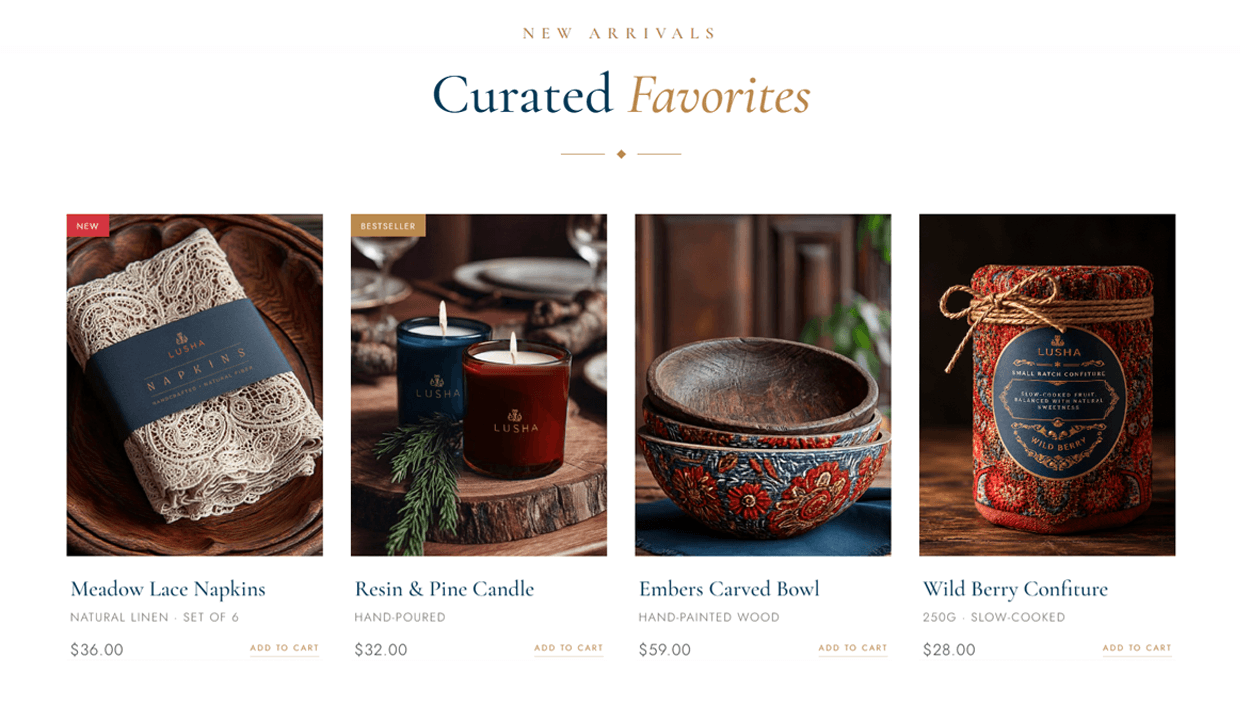
A slow, cinematic hero that gives way to shop-by-category, curated edits and brand story — the whole system, in motion. Built in Framer, ready to scale.

A slow, cinematic hero that gives way to shop-by-category, curated edits and brand story — the whole system, in motion. Built in Framer, ready to scale.

LIVE Website In MOTION

Social, by formula

A feeling, turned into a feed.

A feeling, turned into a feed.

A feeling, turned into a feed.

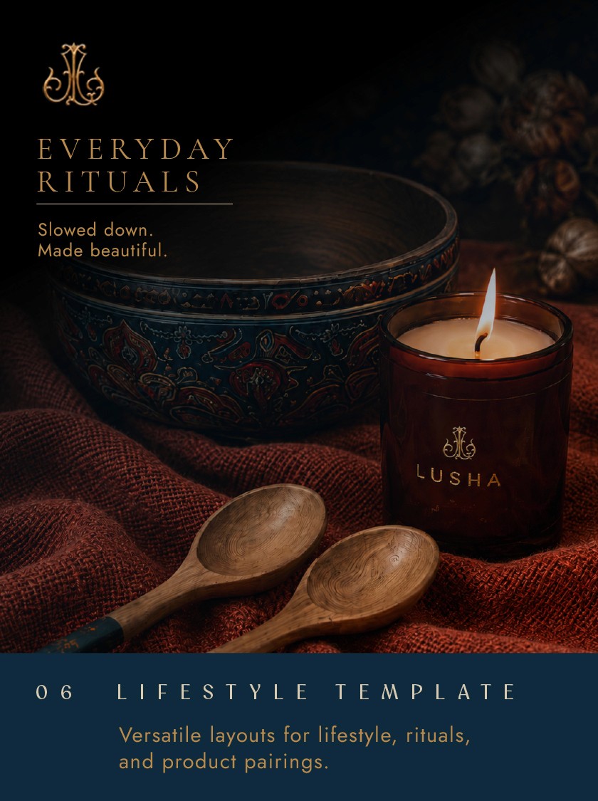
Six modular templates — hero, grid, product, story, collection, lifestyle — endlessly composable and unmistakably Lusha. The system doesn't just hold; it performs.

Six modular templates — hero, grid, product, story, collection, lifestyle — endlessly composable and unmistakably Lusha. The system doesn’t just hold; it performs.

MERCHANDISE. CAPS & DRINKWARE

CAMPAIGN KEYS

Built to stop the scroll.

Built to stop the scroll.

Built to stop the scroll.

CUE STUDIO

Building a brand that should look expensive?

Building a brand that should look expensive?

Building a brand that should look expensive?

That’s the whole job. We’ll make yours look like it always existed — from the name out.

That’s the whole job. We’ll make yours look like it always existed — from the name out.

Our Work

Our Work

Our Work